| Motion Graphics (aka: Motion Design) | |
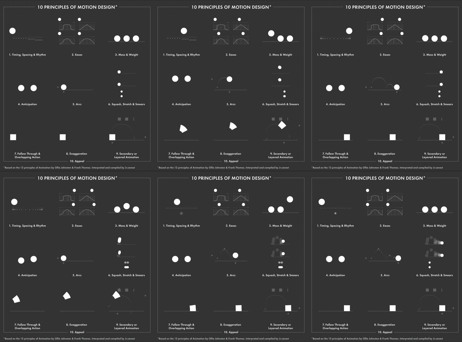
| As motion graphics use animation to move text and images around the screen, it’s important to understand animation principles. |
|
 |
Squash, Stretch & Smears As objects in reality move, the forces they encounter like the ground or the air they move through affect their form. The more malleable they are, the more expressive they become. Follow Through & Overlapping Action In the same way that movements have anticipatory movements, changes that require a large amount of force take a lot of force to stop them. Exaggeration When we look at a real object, we have no cause to believe that it isn’t real. A simple square doesn’t have all of the attributes that a person does that clue us into their vitality and personality. We can use exaggeration to engage our audience. Secondary and Layered Animation Simple things have to work very hard to retain our attention. A single movement will not stand out in a busy stage. If you can find additional ways to show that an object is going through change, you can add interest and exaggeration to an animation. Appeal This last principle is simple yet incredibly important. Is the animation and design appealing to look at?
|